A wallet built to turn
one-off buyers into regulars.
Role
Research, strategy, design
2 designers, 3 PMs
Timeline
Apr 2025 – Feb 2026
Launched Oct 2025
Type
Co-branded wallet
Accrue embed SDK
Domain
Fintech
Compliance & banking
A retailer wanted loyalty.
We built them a wallet.
SNIPES is a global footwear and athleisure retailer headquartered in Germany. Accrue partnered with them on a loyalty wallet, embedded in their app through our SDK.
Three goals
A version existed when I joined in April 2025, and it had a long way to go.
TL;DR
Context
SNIPES wanted loyalty. Accrue built them a wallet: pre-load money, pay in store, earn on both. Raise basket size, cut churn, turn one-off buyers into regulars.
What I did
Sat with 18 people before drawing anything, rebuilt the flow around trust and clarity, then ran focus groups with 50+ after launch that sent the checkout model back to the drawing board.
What happened
Launched October 2025. Basket size up $45, repeat purchases tripled, 16% wallet penetration in five months. One bottom sheet took backup payment from 29% to 72%.
I wrote the script
and built the prototype.
Eighteen people, thirty minutes each: store employees, sneaker enthusiasts, and general shoppers. This was the first of two rounds; 50+ more came after launch.
What I asked them to do
- Register
- Create an account
- Set up the wallet
- Load cash
- Add a backup payment method
- Explain the rewards back to me
The last one turned out to matter most. Every other task told me whether someone could finish a flow. That one told me whether the product made sense.
What I listened for
Where they stopped, what they reread, and what they asked me instead of the screen.
Six problems.
Every one of them a missing why.
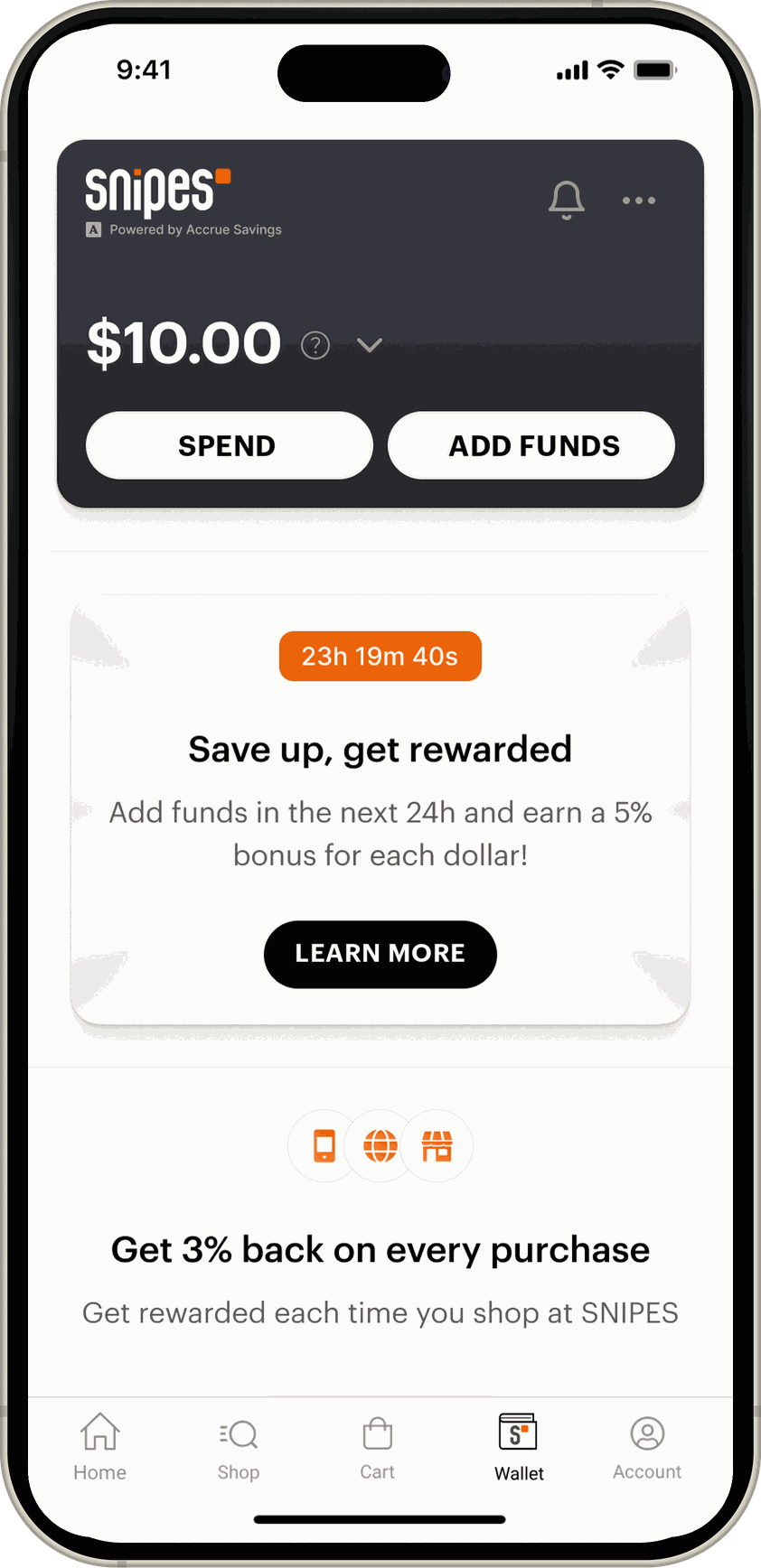
Nobody understood they could not earn twice
5% for loading cash, 3% for shopping. Almost nobody worked out that the same money does not earn on both.
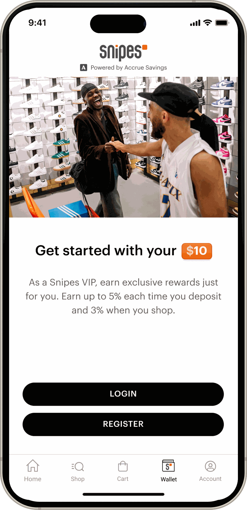
Identity was asked for before the product had earned it
Register with SNIPES, create a Reserve account, then complete your profile, which is KYC. People had not decided the programme was worth their information yet.
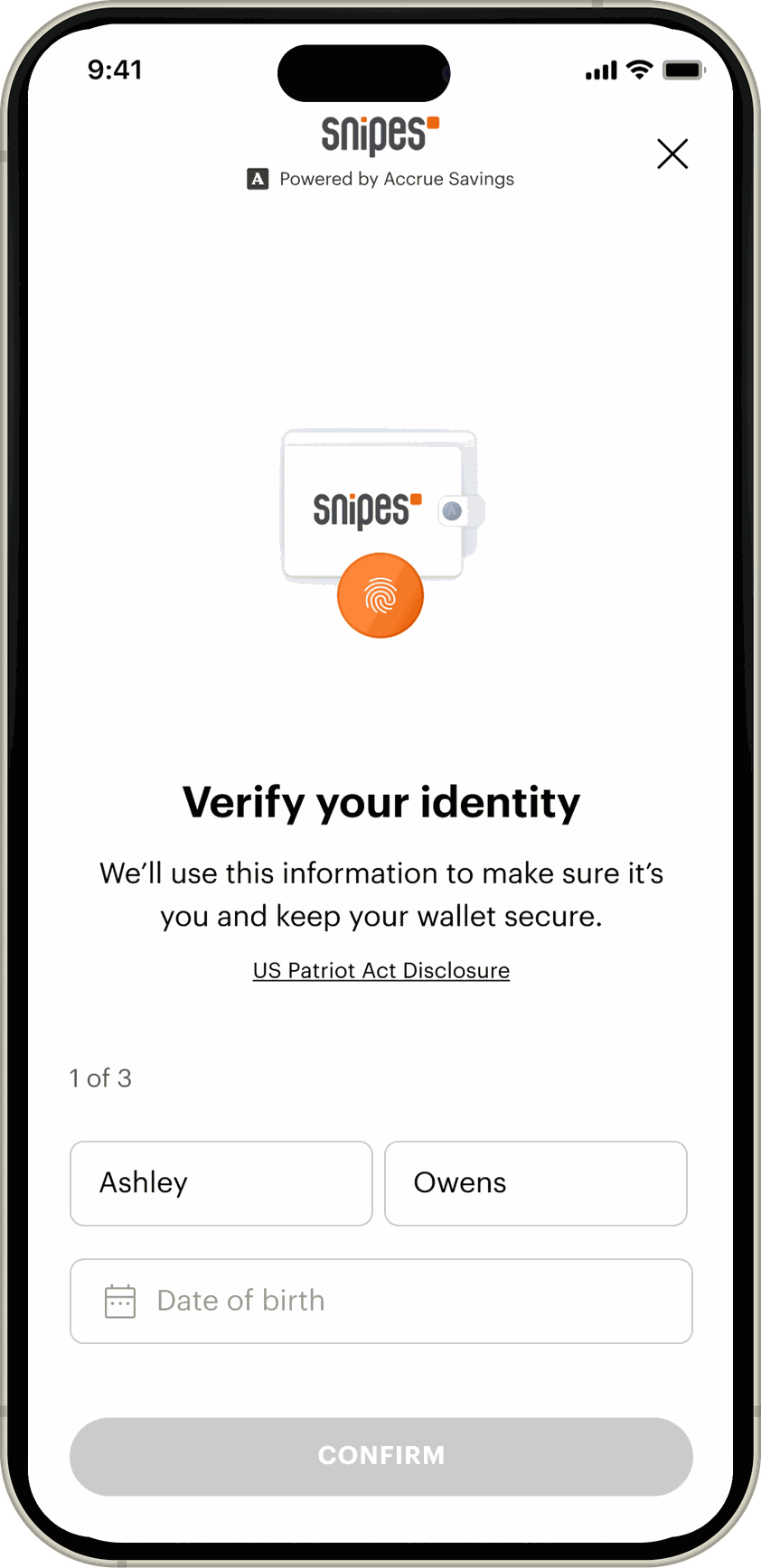
“Verify your identity” read as a credit check
13 of 18 asked whether they had to give a social security number. The wording did the damage, not the ask.
Backup payment never said what it was for
“Why do you need my card info?” was the most common sentence in the study. Only five of the eighteen added one at all, and those five could not find where to remove it. The other thirteen would rather put money in than hand over a card.
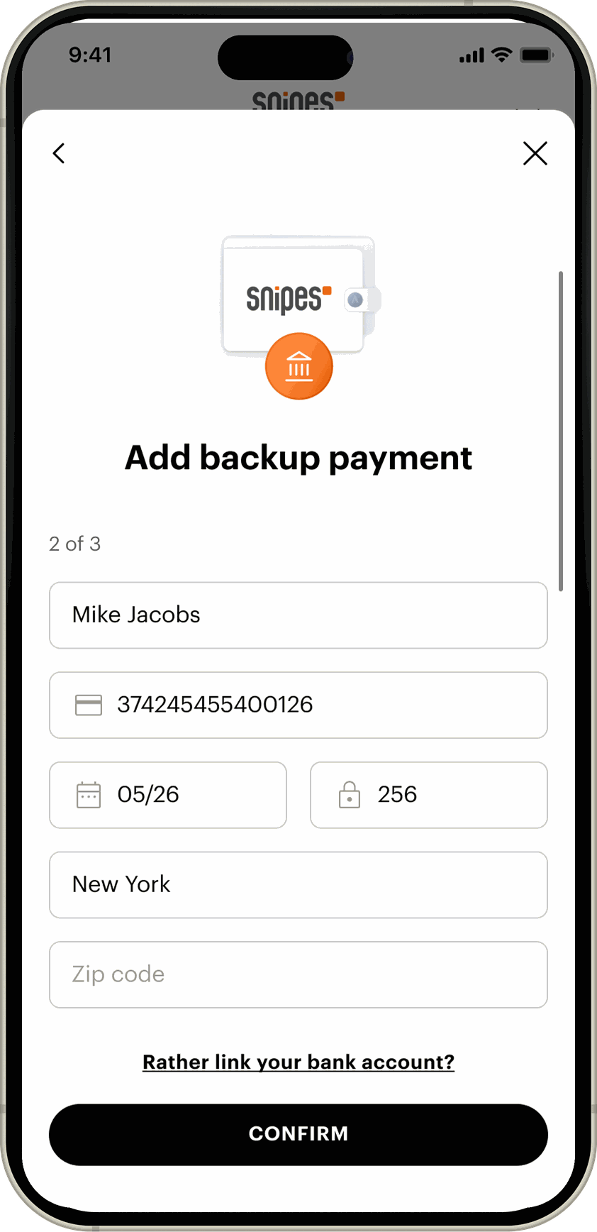
Only two ways to pay, and both were work
Type a card in by hand or connect a bank over ACH. People expected Apple Pay and were uneasy about linking a bank account. “I need to get up and find the card. Why not Apple Pay?”
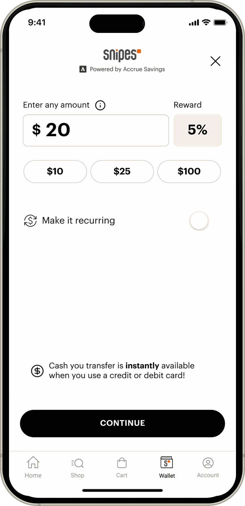
The reward needed mental arithmetic
A large 5% card with the actual dollar amount set small underneath it. Most people missed the number that told them what they had earned.
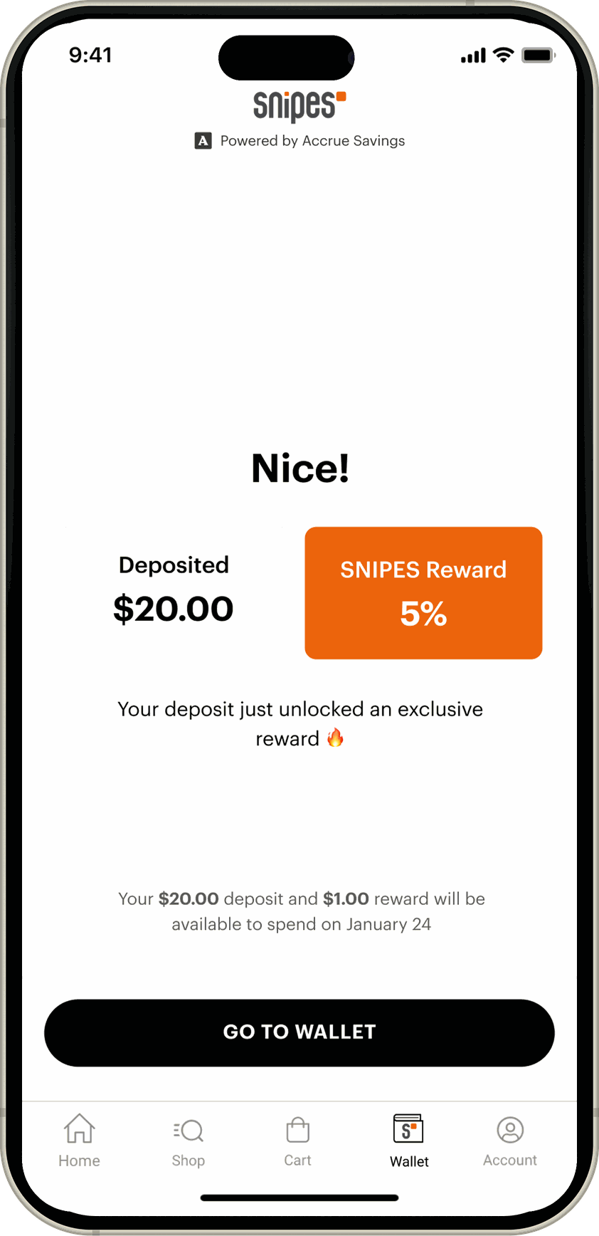
Six problems,
two causes.
I ran the transcripts through AI to transcribe and code them, then read the clusters back against my notes. Everything collapsed into two.
Trust
It asked before it had earned the right to
Identity, an address, a card, all requested before the product had shown anyone what it was for. The word verify made it worse, and ACH made it worse again.
Clarity
It never said why, or what for
Two reward rates nobody could reconcile, a percentage where a dollar amount belonged, and a card on file with no stated purpose. You could remove it, but it was buried far enough that nobody found it without help.
The test every screen had to pass
Has this screen earned what it is asking for, and has it said why?
Two questions, applied to everything in the flow. That is what the rebuild was measured against, and what I carried into every surface after onboarding.
A month of sketches,
then back to the same people.
Six problems came down to trust and clarity, and the two pull against each other. Every version here tests the same trade: ask for less, or say why sooner.


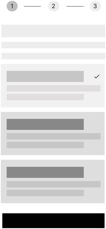
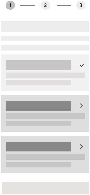
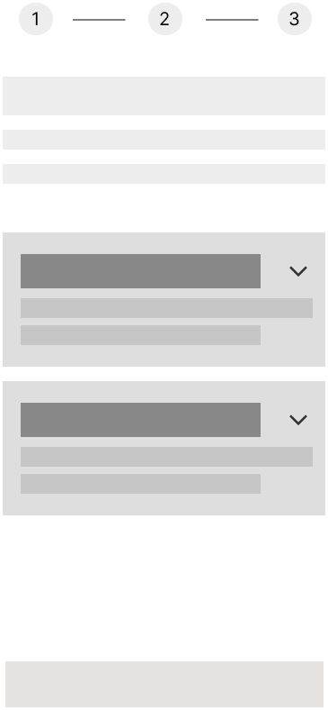
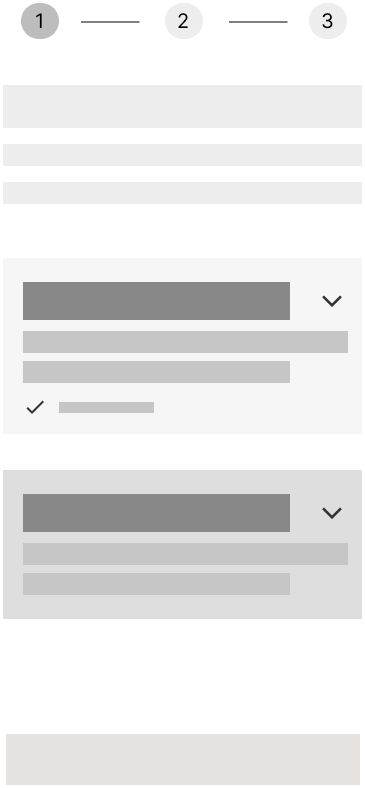
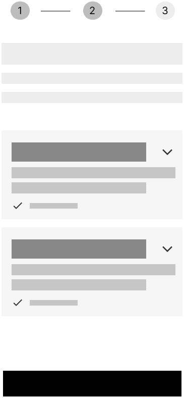
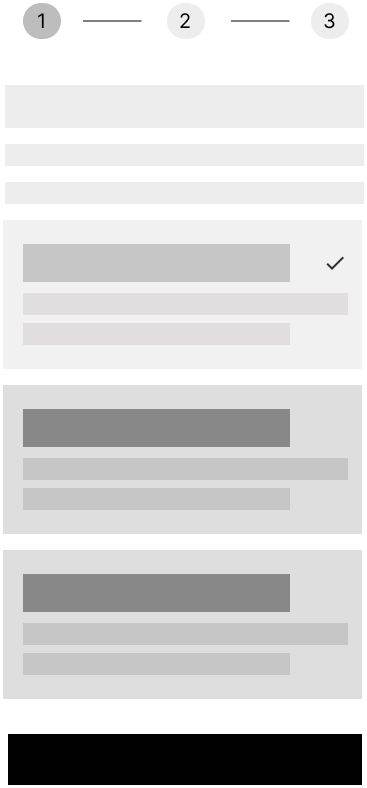
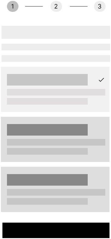
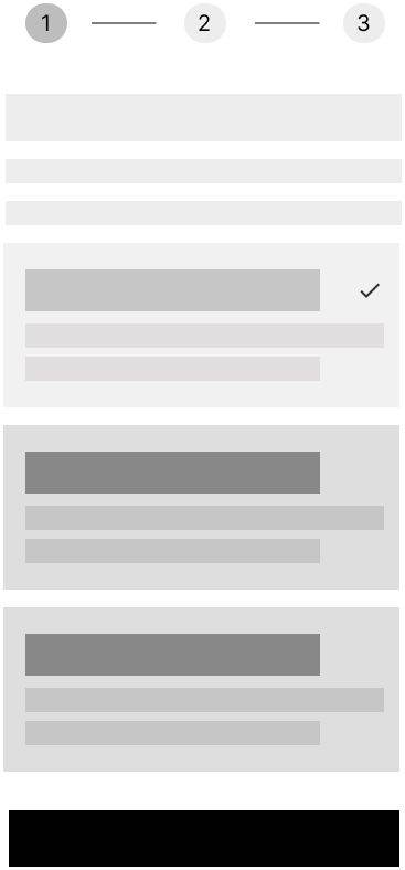
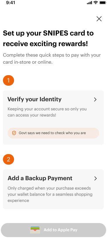
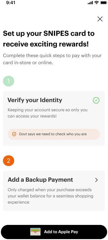
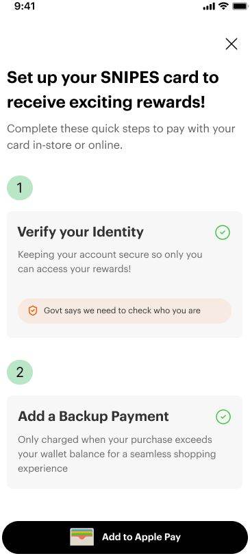
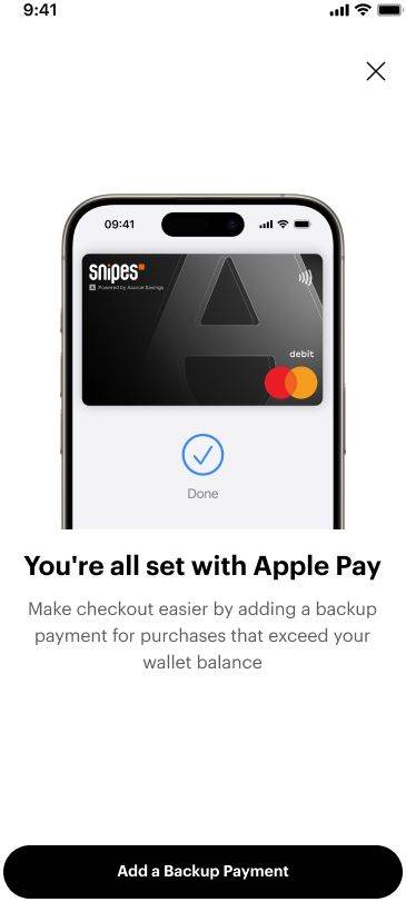
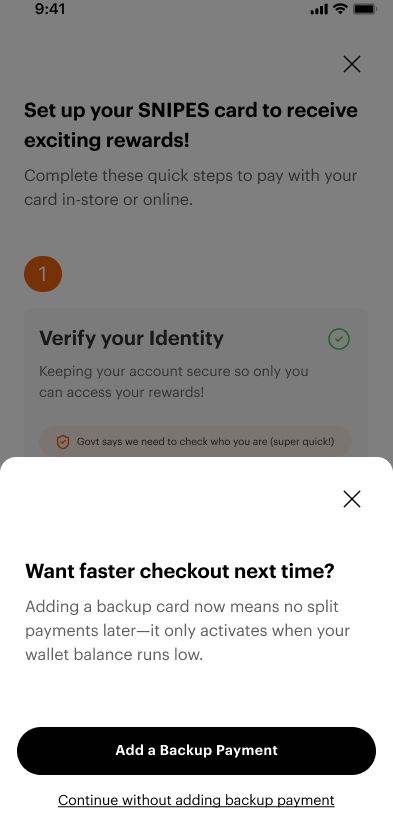
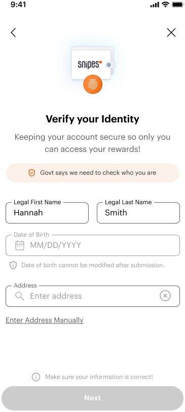
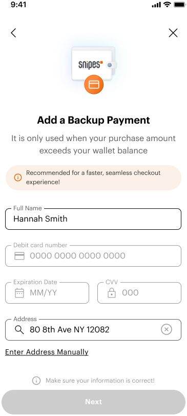
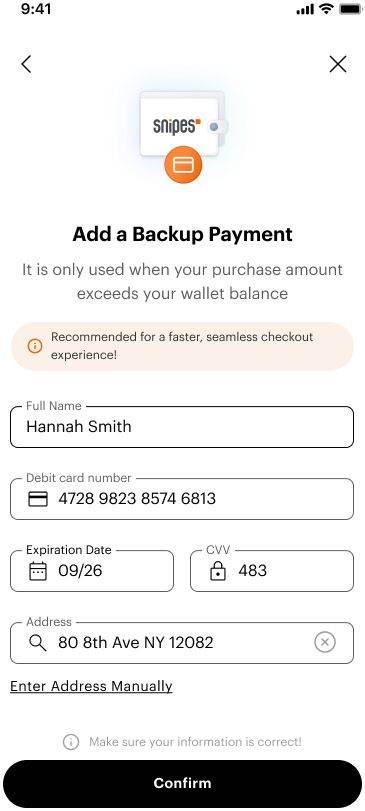
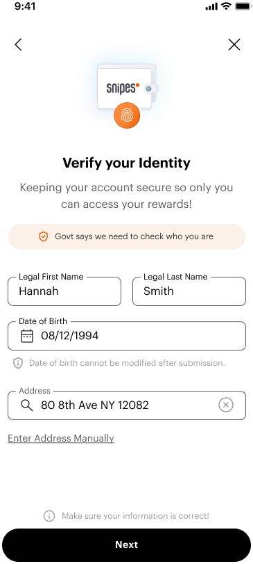
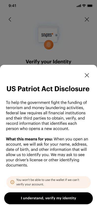
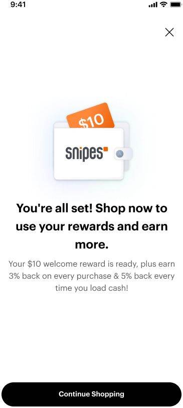
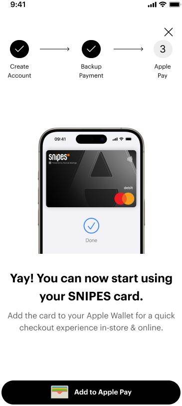
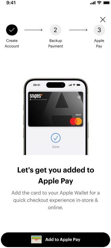
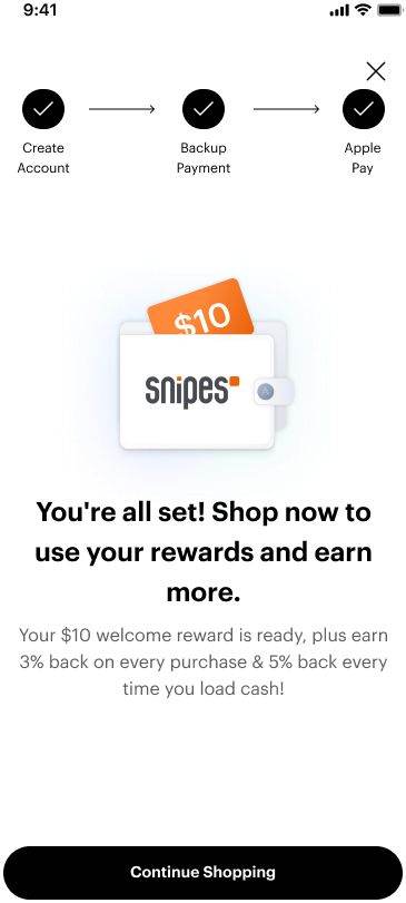
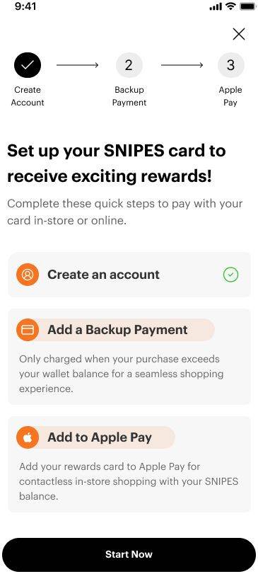
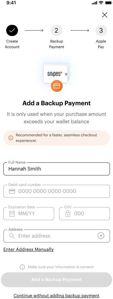
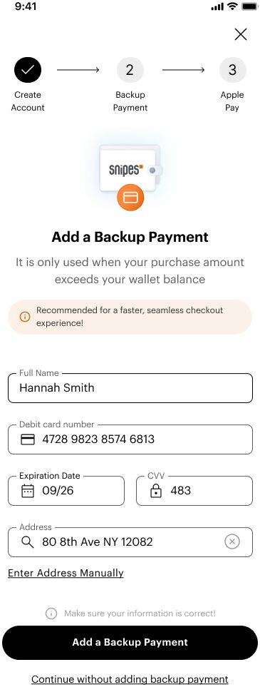
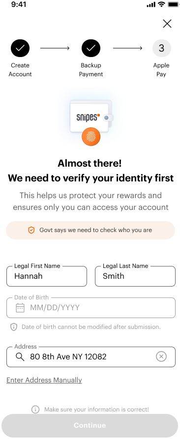
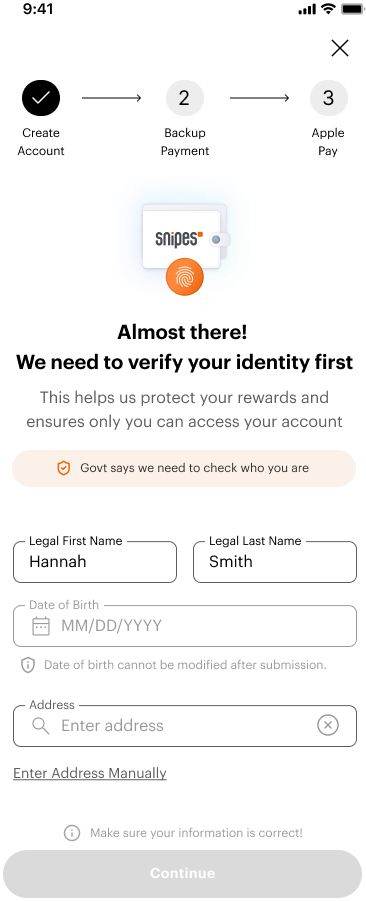
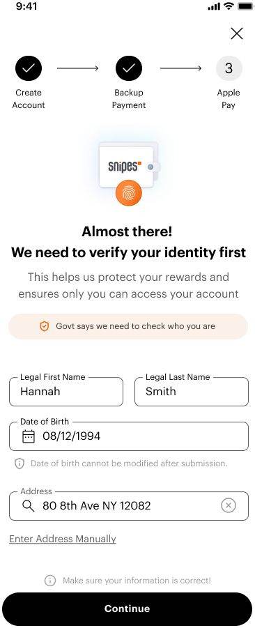
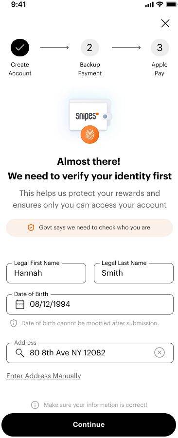
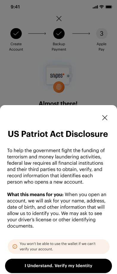
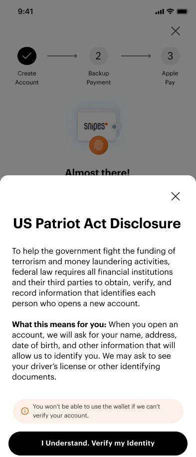
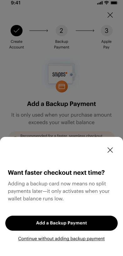
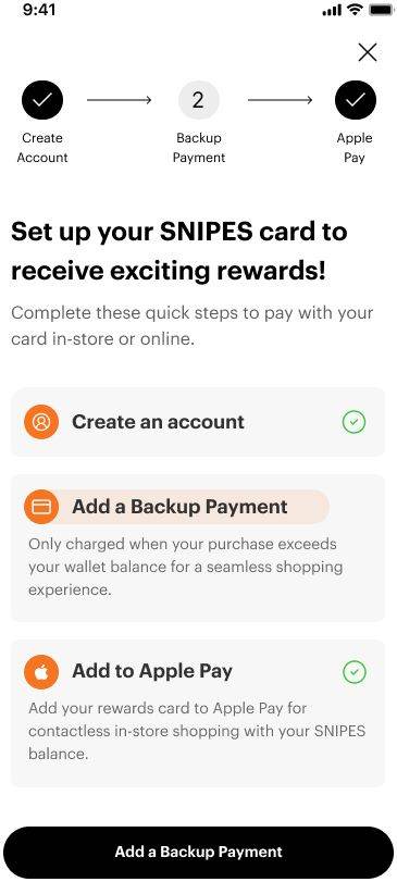
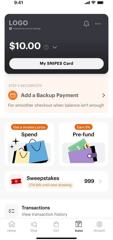
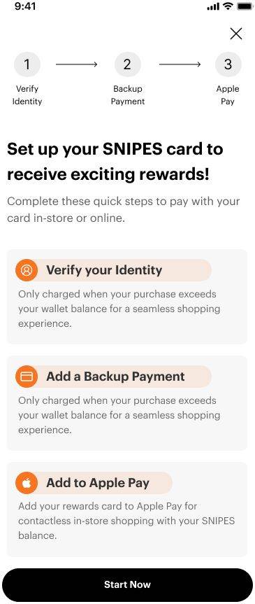
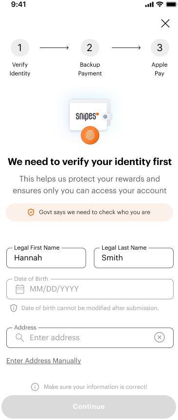
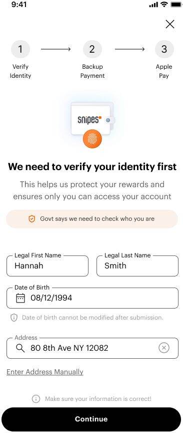
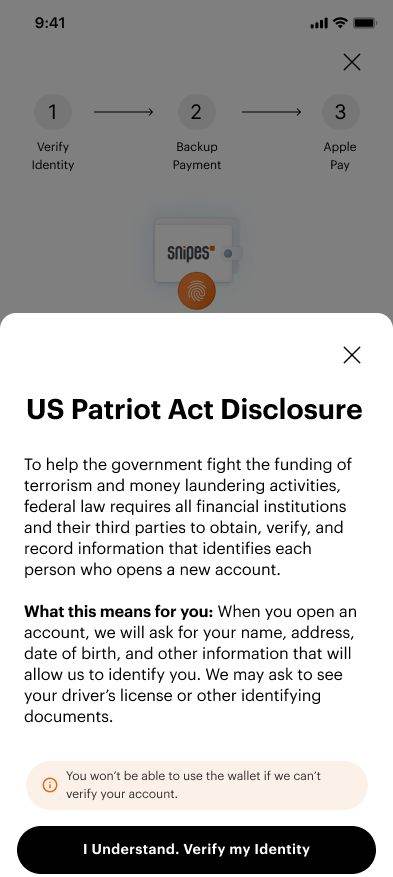
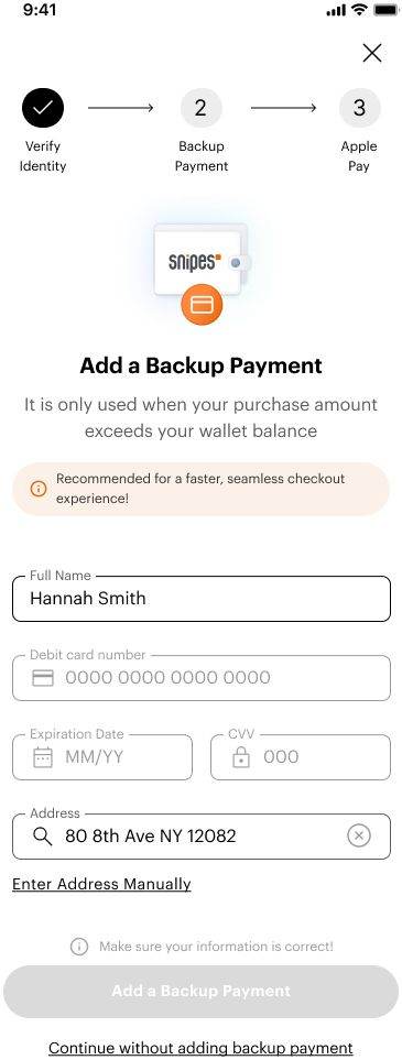
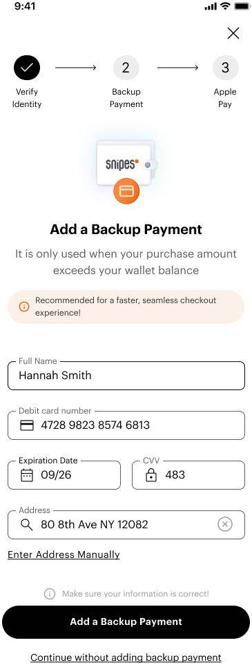
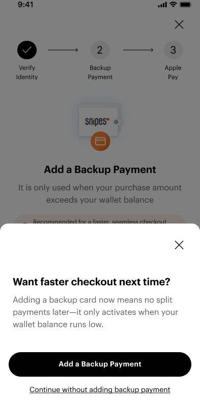
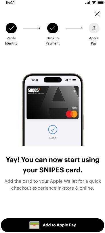
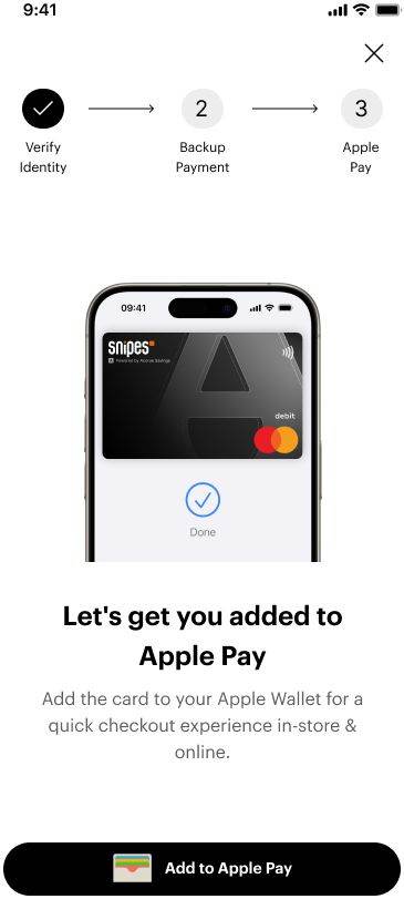
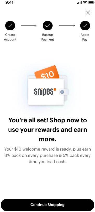
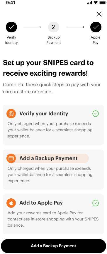
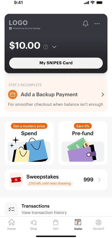
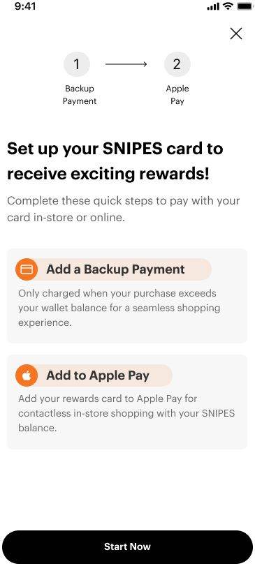
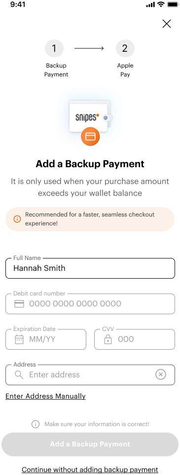
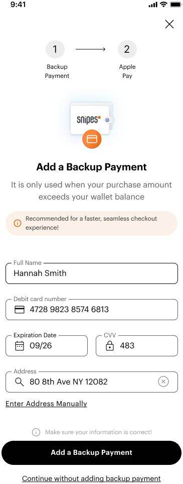
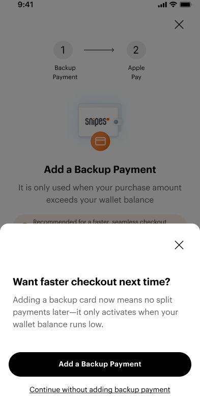
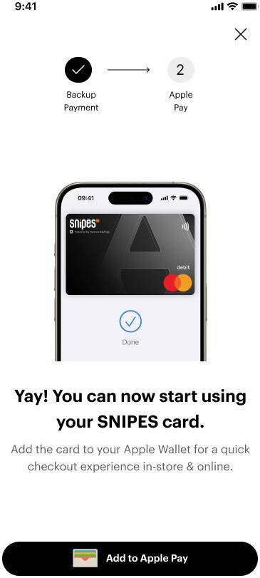
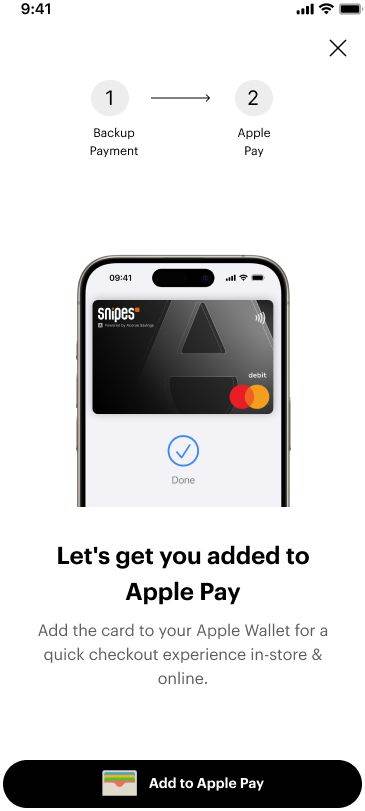
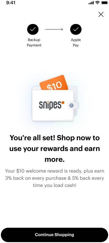
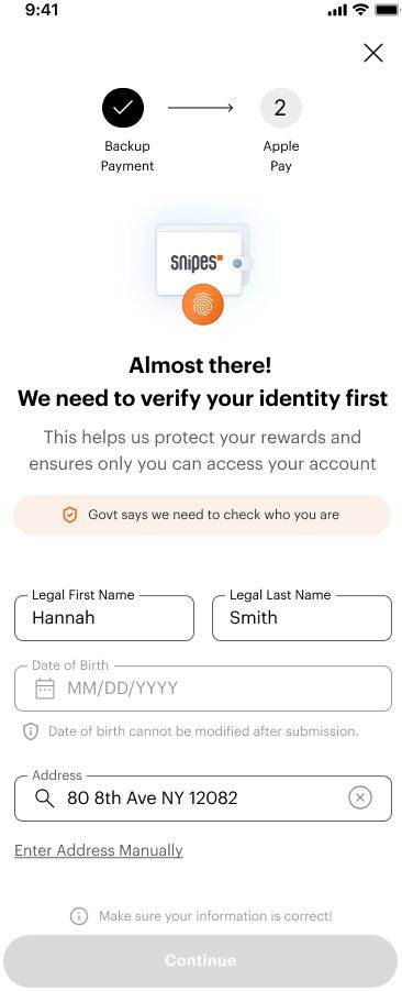
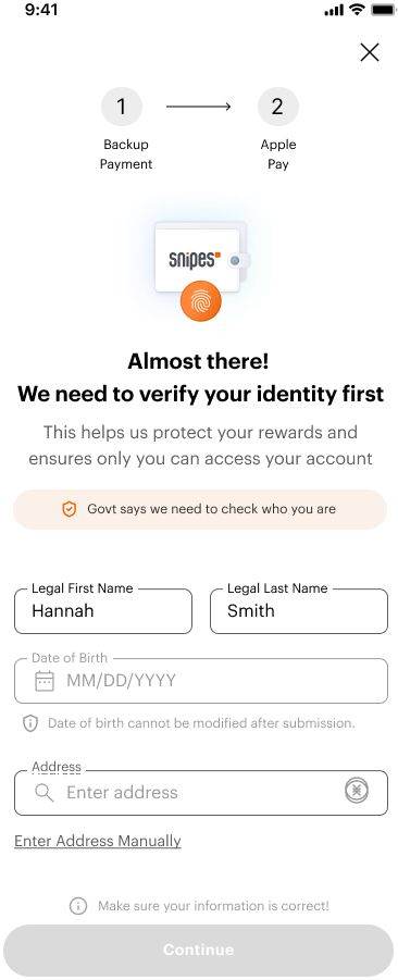
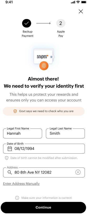
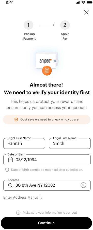
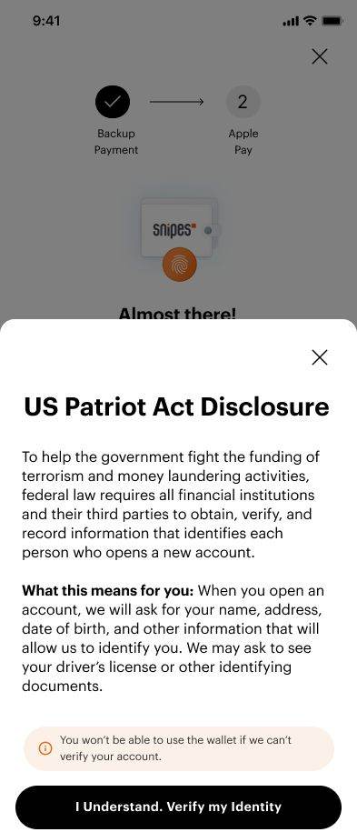
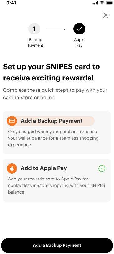
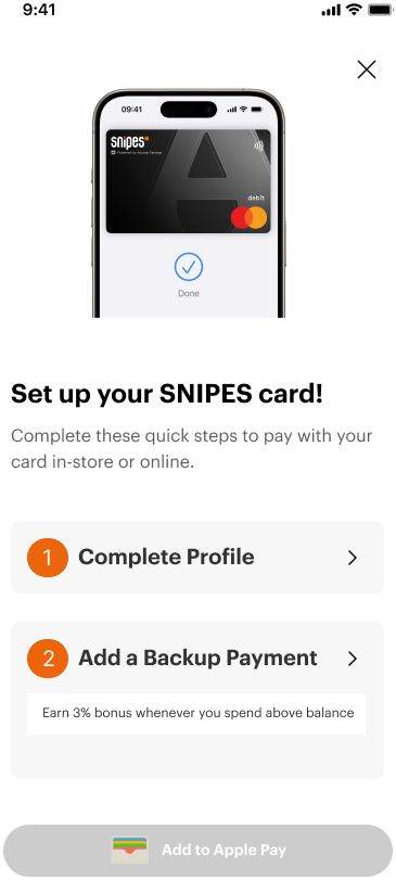
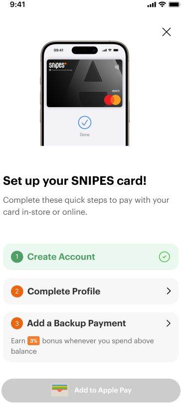
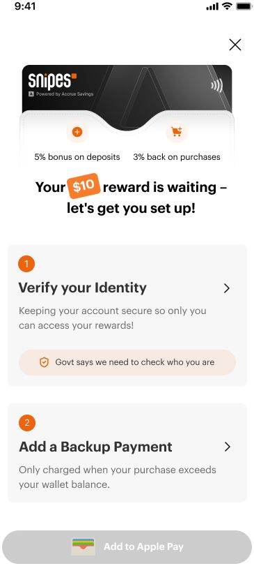
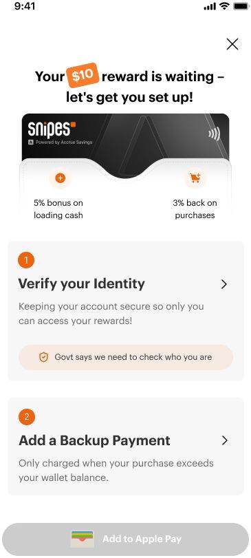
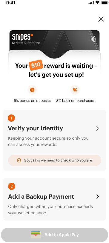
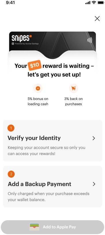
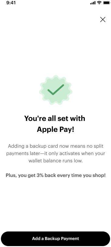
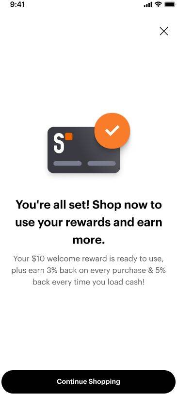
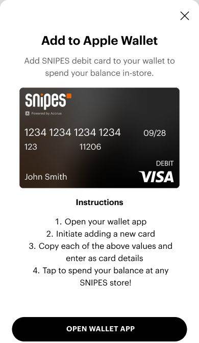
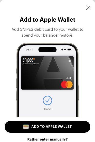
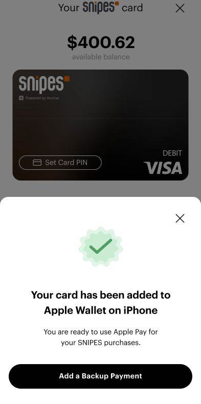
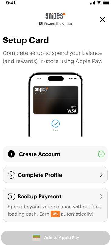
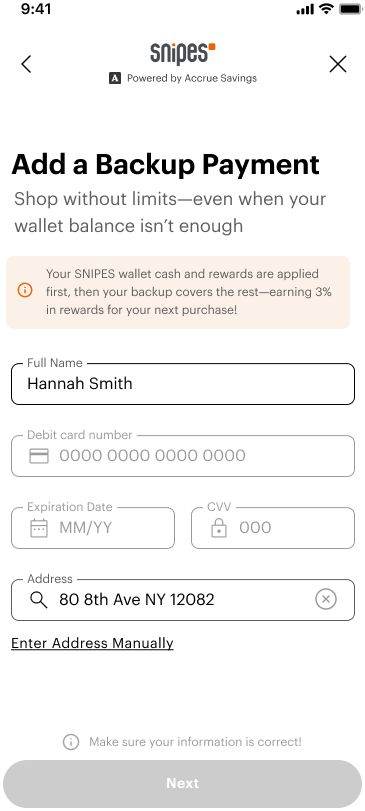
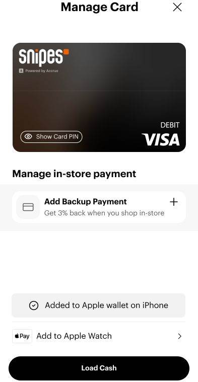
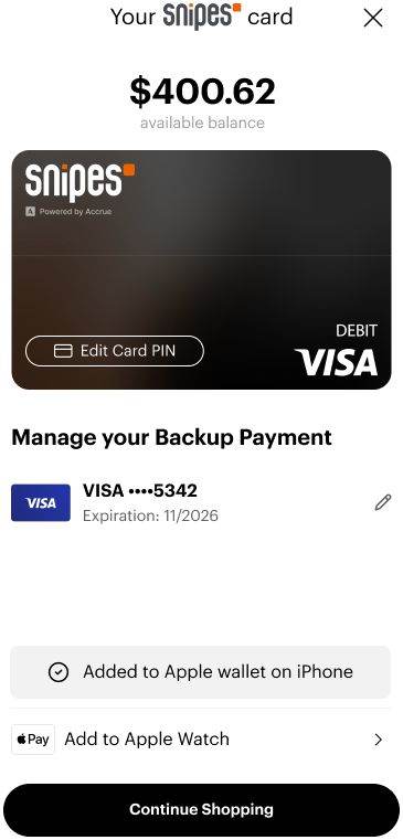
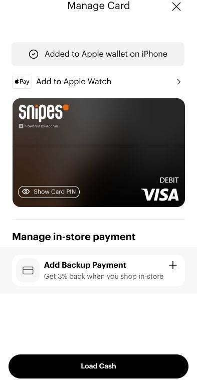
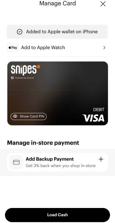
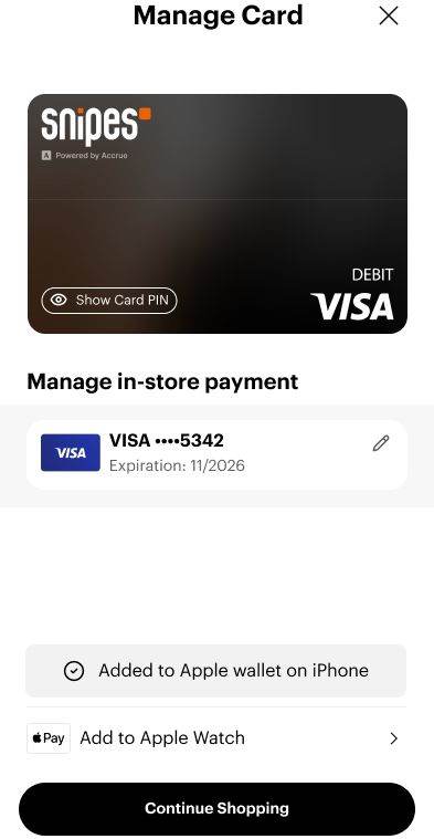
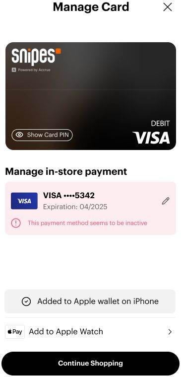
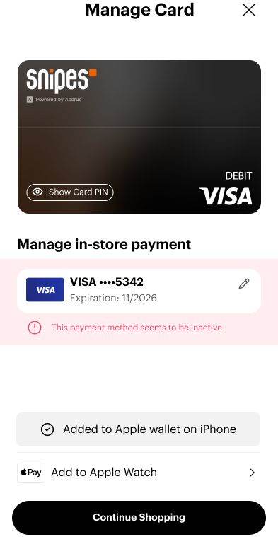
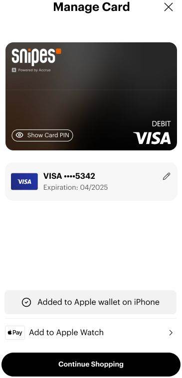
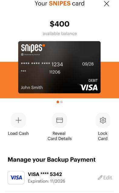
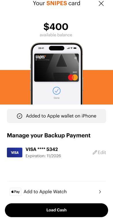
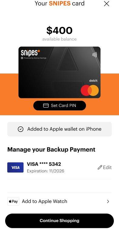
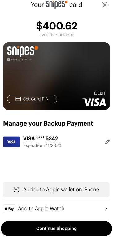
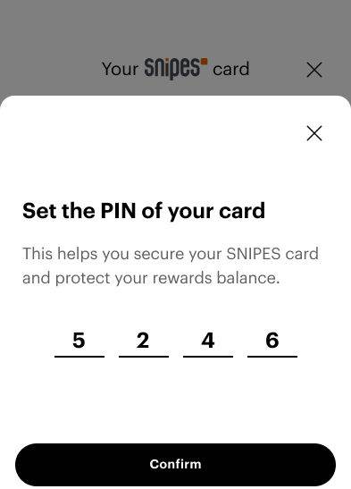
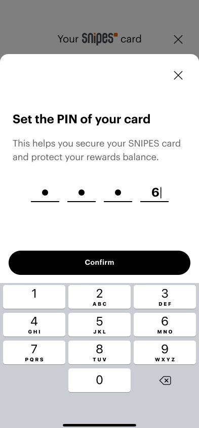
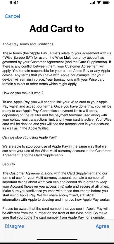
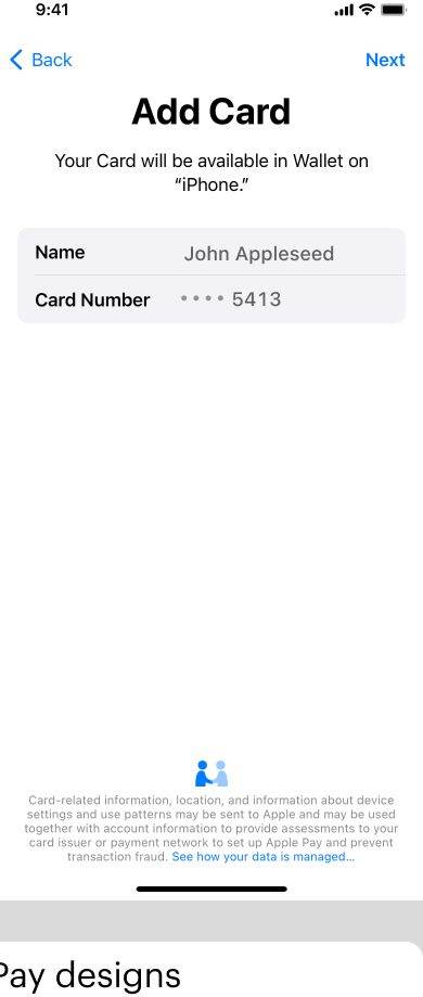
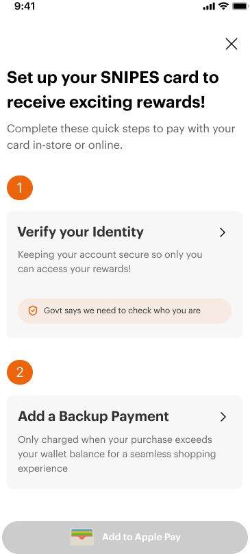
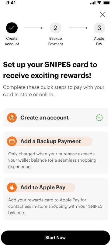
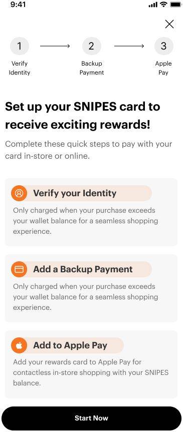
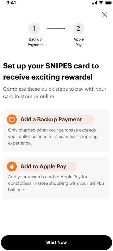
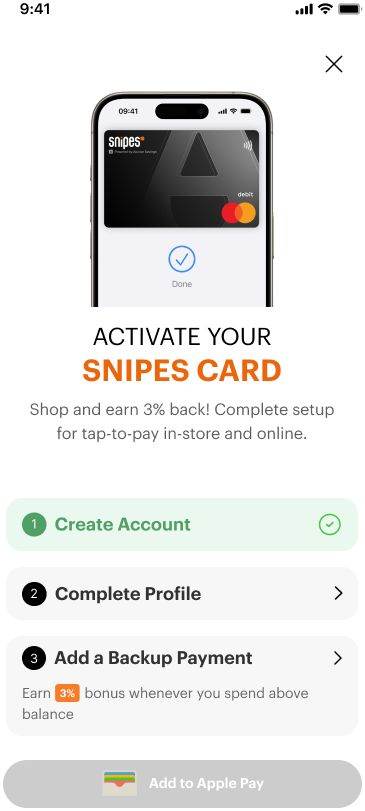
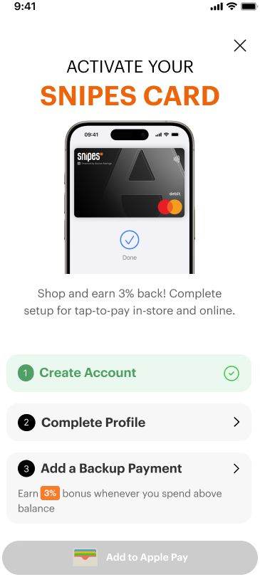
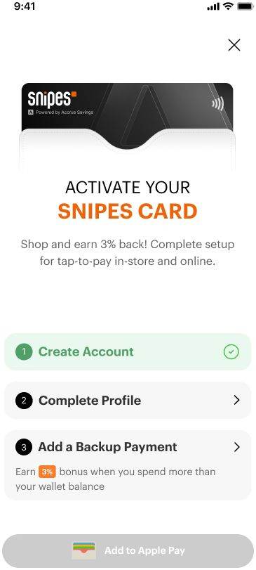
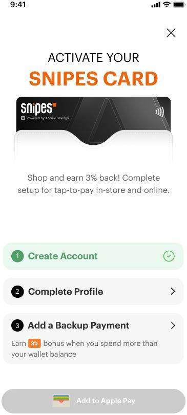
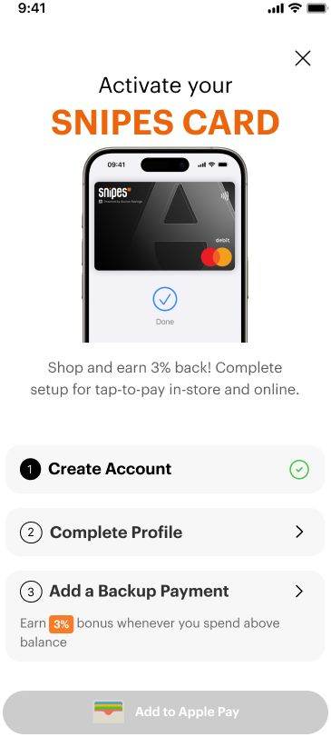
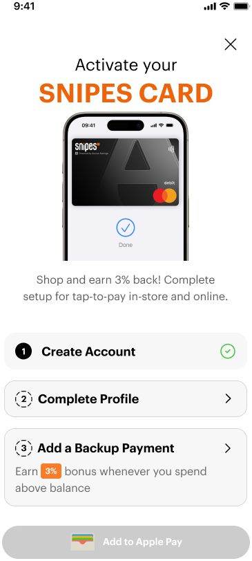
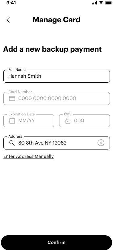
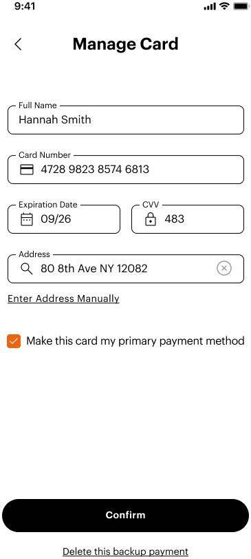
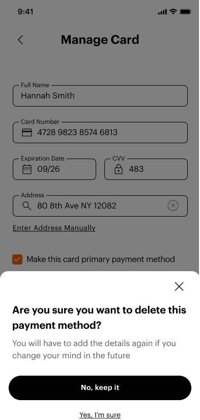
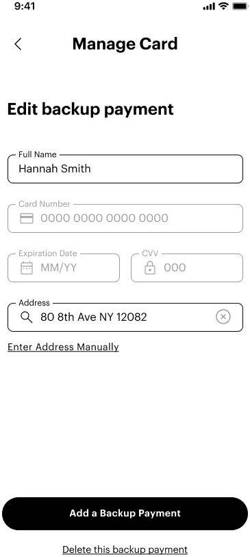
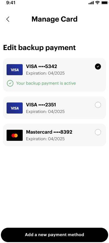
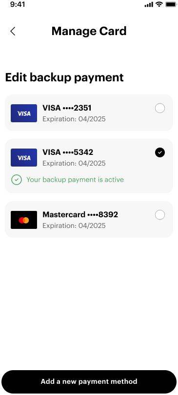
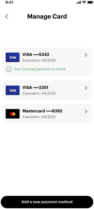
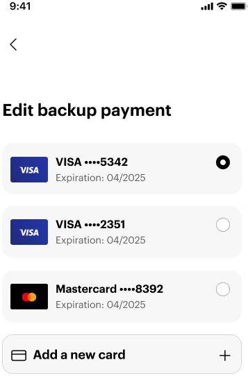
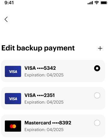
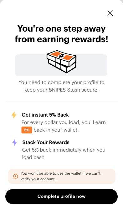
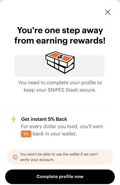
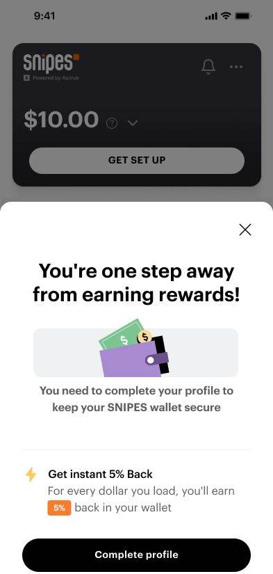
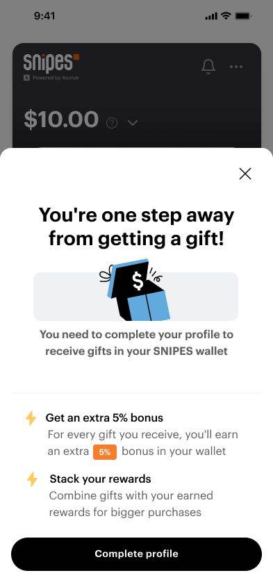
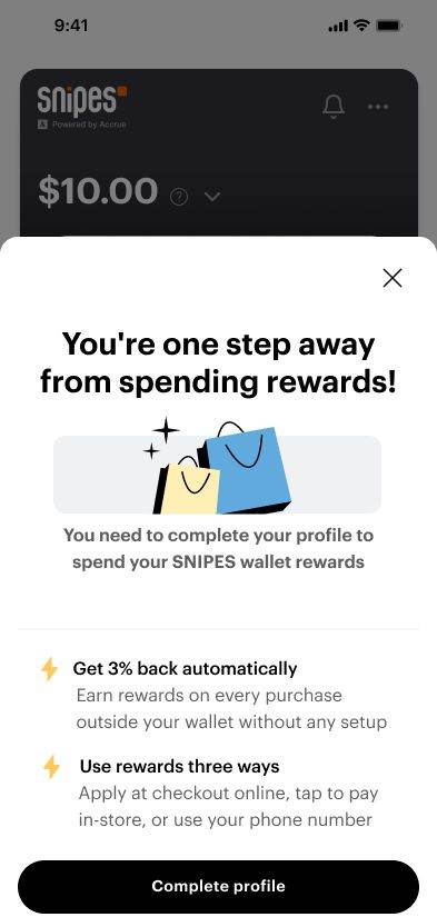
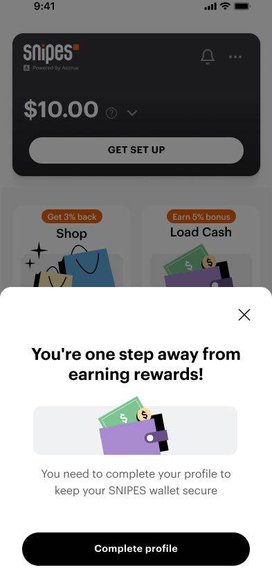
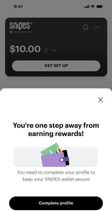
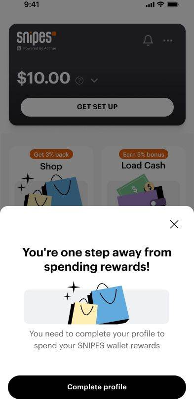
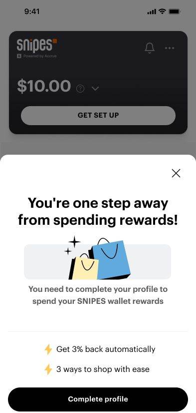
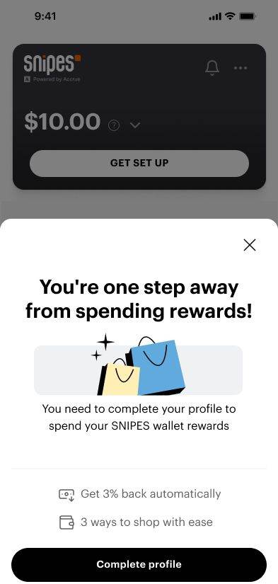
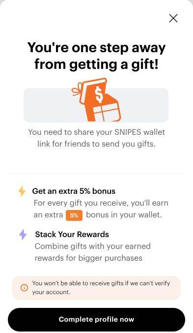
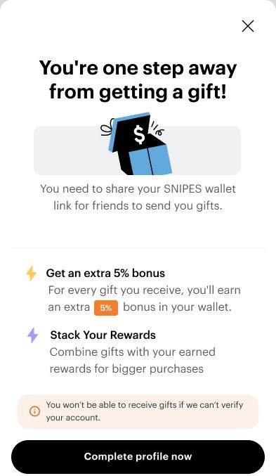
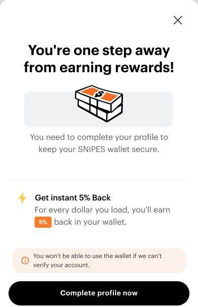
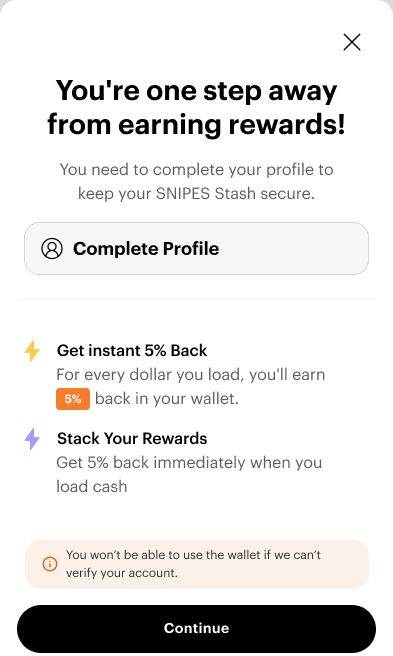
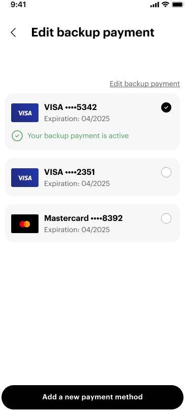
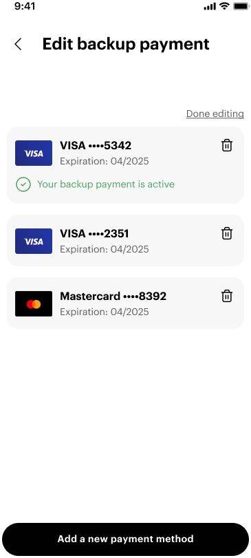
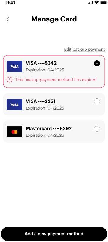
I worked through the flow with the PMs across a month of versions, then ran it past the same eighteen who had broken the first one.
Going back to the same group matters: they already knew where the old flow hurt, so their reaction was to the change rather than to the product.
Twelve steps,
walked in three.
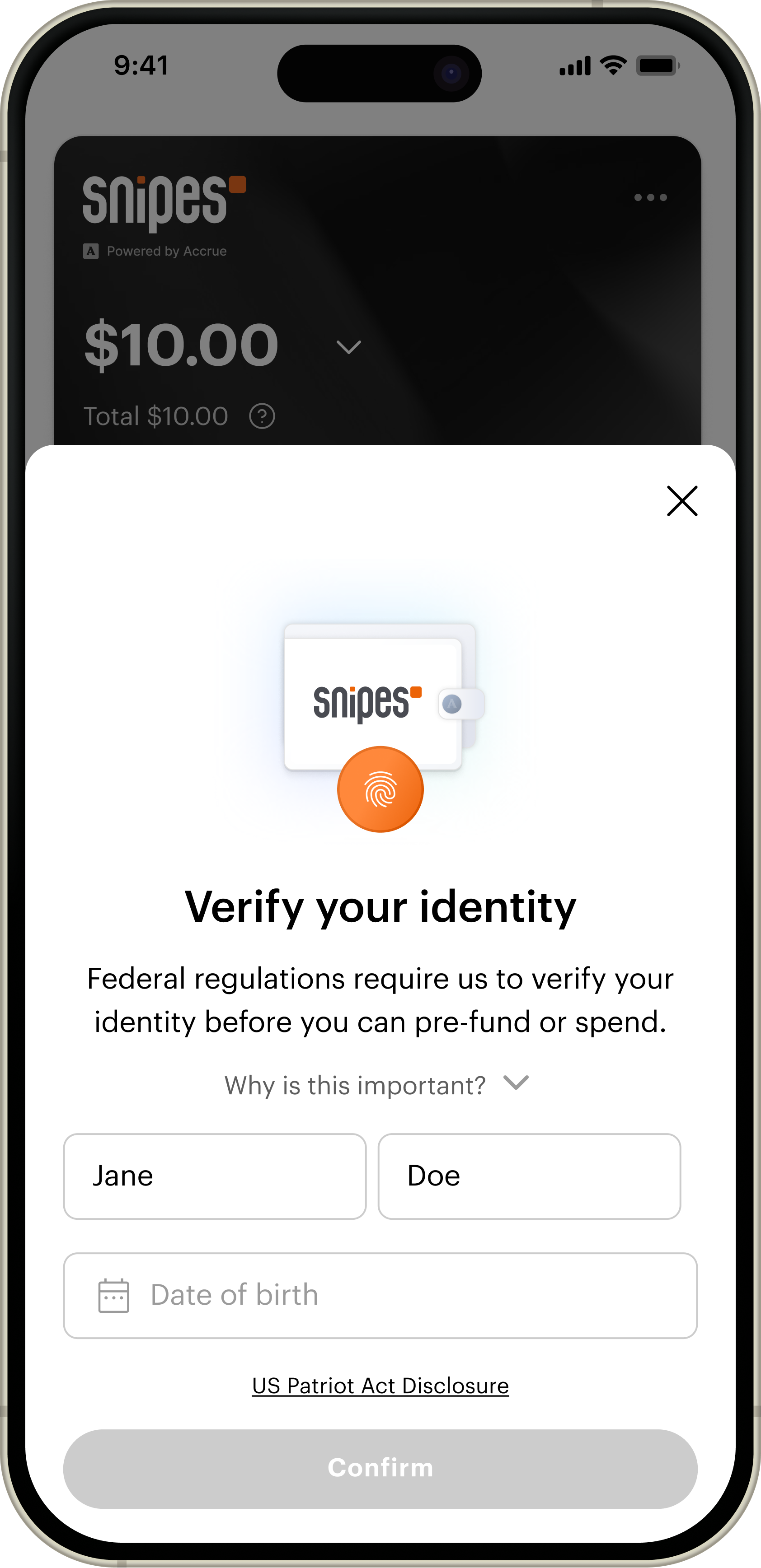
What came out the other side, start to finish. Each step names the change and shows the screen it landed on.
October 2025.
Three steps, live in stores.
The rebuilt onboarding went out to every SNIPES store and to the app. Twelve steps down to three, with the reason stated before each ask.
The second round
ran on a live product.
After launch I ran focus groups with more than 50 users. A shipped wallet being used in a real store surfaces things no prototype in a room can.
Those sessions, alongside what was coming in through customer support, are what turned a checkout model we had already built into a question worth reopening.

The groups and the support calls
pointed at the same thing.
Store associates could not see a customer's balance on their own system. With tap to pay the transaction happens between the phone and the terminal.
No shared view
The associate is guiding someone through a payment they cannot see.
No way to remind
A customer with $40 in the wallet pays by card, and nobody at the counter knows to mention it.
Hand-holding at the register
Which is the one place in the store where time is expensive.
SNIPES and Accrue moved the checkout model to a barcode. It put the balance on a screen both people are looking at, and it sent me back to the drawing board mid-flight.
A sheet, a barcode,
and one honest question.
We had deliberately never forced a card, because the first study said people abandon anything that feels compulsory, and most of them would rather top the wallet up than hand one over. So the backup payment problem had to be solved by timing instead.
The fix that paid
One bottom sheet
29% to 72% on backup payment
Right after the load-cash confirmation, at the moment you see what you earned, a sheet offers the card you just used as your backup, toggle already on. Nothing new to type. Backup payment setup went from under a third of users to nearly three quarters.

The pivot
Scan to pay
The barcode gives the associate something to see
Tap to pay left store associates blind. The barcode puts the balance on a screen both people are looking at, which is what the counter interaction needed.

Where it landed
Load cash, or add a card
The choice, stated plainly
Thirteen of the eighteen had already shown they would rather load cash than hand over a card, so the final flow stops guessing which one you want. It asks once, side by side, with the value of each spelled out and skip always available.

Try the whole flow

What the wallet moved,
and what the flow moved.
Two kinds of number, kept apart. The first three are what the wallet was built to do. The next four are what the onboarding underneath it did to get there.
Those came out of a flow that got shorter and less frightening.
Backup payment set up. The bottom sheet asked at the moment the card was about to matter, rather than during a signup nobody had committed to yet.
The funnel today
Two thirds of the people who sign up finish identity verification. For a flow that opens with a federal disclosure, that is the number the rewrite was for.
Mixpanel · SNIPES · unique users · 90 days to 30 Sep 2026
What the sessions look like
Across 21,126 sessions on the identity step. The screen people used to ask me about in person now gets clicked at and nothing else.
Long enough to read it. The copy that explains why is being used, rather than skipped on the way to the button.
October 2025 to September 2026. January, the month the original write-up quoted, was 18,386.
Microsoft Clarity, 30 days to 30 Sep 2026 · Mixpanel for the wallet count
My learning
What worked
Asking people to explain the rewards back to me. Every other task told me whether they could finish a flow; that one told me whether the product made sense.
What I would redo
Test in the store earlier. The associate problem was invisible in a room and obvious at a counter, and it cost us a checkout model.
What I am watching
Whether the barcode holds up at a busy register, and whether the load-cash habit survives without the bottom sheet prompting it.
Every one of the six problems was language, not features. Nothing needed rebuilding. It needed saying differently, and saying why before asking for anything.